|
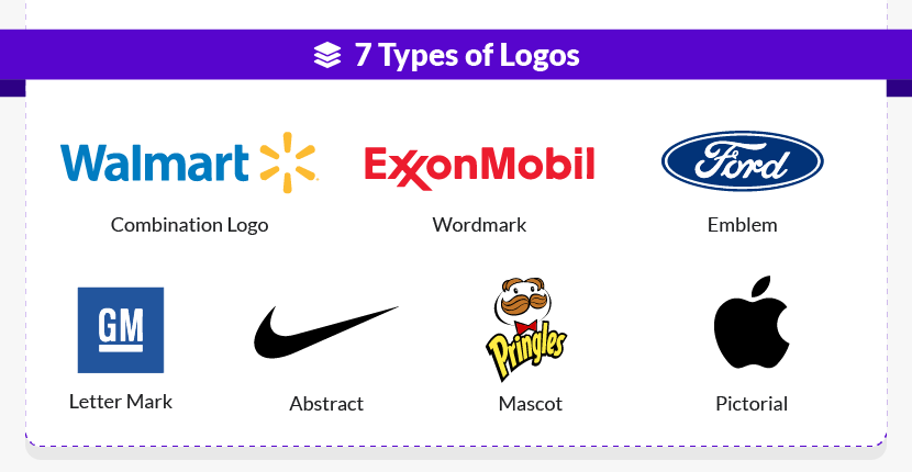
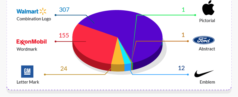
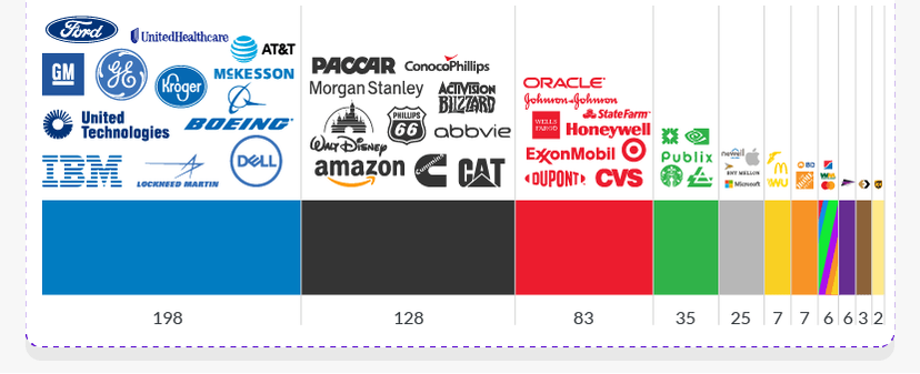
There are so many “best practices” in logo design that it’s easy to get lost in all that knowledge. But even the most experienced designers and biggest brand enthusiasts among us can always learn something new. That’s why I’ve done the research and I'm here to shake things up with the most up-to-date logo statistics from the Fortune 500 list. I’ll be sharing statistics, interesting trends, and fun facts about logos and branding. Busy CEO, in-house marketer, or even freelancer, you’re sure to find something that will help you grow your brand and boost your business. Current Logo Design Trends from Top Companies Successful logo design is a balance between fitting in and standing out, adhering to best practices without getting too generic. So how do the most successful companies in the world achieve this tricky design balance? Let’s look at the numbers to find out. We compiled the following logo statistics by analyzing companies from the 2019 Fortune 500 list. 1. Combination Logos Rule the Field I divided the Fortune 500 logos into seven distinct types to see which logo style is most popular. And the findings are pretty clear: combination logos rule! Of these top 500 companies, over 60% use combination logos. The full breakdown is as follows:
Which logo types do fortune 500 companies use? It’s no surprise that combination logos are so popular. By including both a wordmark and an icon, combination logos are incredibly versatile – allowing companies to use the icon, the text, or the full combination depending on the context of the logo. In case you’re curious, the two companies that generally use stand-alone icons? They’re none other than Nike (abstract icon) and Apple (pictorial icon). No wordmark needed here! 2. The Most Popular Colour Is Blue Among Fortune 500 companies, blue is the top logo colour by far, accounting for nearly 40% of the entire list. Want more detail? Here’s a look into the full logo breakdown by colour, sorted from most popular color to least popular color:
Which colour is the most popular in logo design? It may be the least popular logo color in terms of numbers, but gold definitely makes a statement! The two companies that use gold, Markel and MGM Resorts International, rely on this unique colour choice to position themselves as high-end, luxury brands. 3. When Combining Colors, Two Is Standard The colour breakdown above is based on each logo’s main colour. Of course, many logos utilize two, three, or even four colours at once – also shown in the blue logos from McKesson and Walmart above. So what’s the most common number of colours within a single logo design? According to our research, two-colour combinations are the most popular:
4. Black and Red Is the Top Combination So which two colours work best together? Of the 217 logos that use two colours, the three most popular colour combinations are:
5. Other Colour Combinations Are More Unique If you’d rather stand out than fit in, consider one of these two-colour combinations for your logo – used by just one or two companies on the entire Fortune 500 list!
*Pink is a very uncommon choice for logos, especially within the traditionally masculine automotive industry. However, AutoNation has used pale pink to create a brand identity built around its breast cancer charity work. Pretty remarkable! ᐩCan you spot the hidden image in the FedEx logo? (Hint: Look between the “E” and the “x.”) Once you’ve seen the arrow pointing forward, you’ll never forget it! For a brand that’s always moving things forward, this clever design is exactly on-point – showing how white space can matter just as much as colour! 6. What About Gradients? Across the web and in print, gradients are super on-trend for 2019 and 2020…but they haven’t caught on for too many of these Fortune 500 logos. Of these 500 global companies, just 34 logos incorporate gradients. The five top-ranking companies with gradients in their logos are:
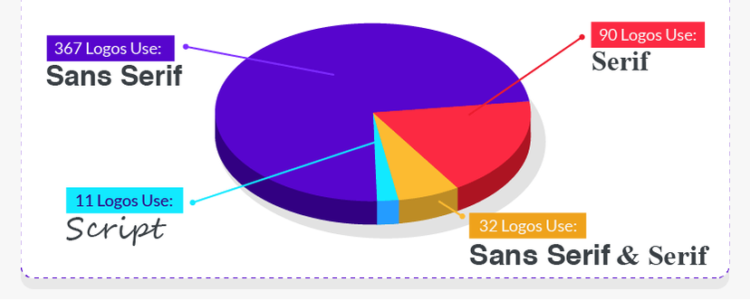
Gradients are also what transforms a normal beige-y brown into a shiny metallic gold, demonstrated in the Markel and MGM logos above. 7. Sans Serif Fonts Are In Among these 500 logos, the most popular font style is sans serif. And we really mean popular! Take a look for yourself at just how common sans serif fonts are:
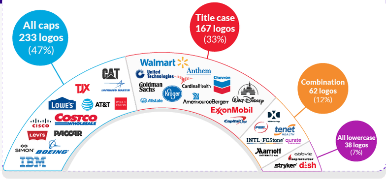
Which style of font is still popular? See Below That means that three-quarters of all Fortune 500 logos use sans serif fonts! A few of the biggest names include: Although sans serif fonts have been around for centuries, they’ve exploded with the advent of computer technology. Why? Because sans serif fonts are historically easier to read on screens. Better screen resolutions are making this “fact” less true by the year, but many companies are still rebranding away from serif fonts and toward sans serif fonts just to stay current. 8. To Capitalise or Not to Capitalise? Some companies stylise their names differently in logos than they do in normal text. For instance, big-name companies such as Mastercard, eBay, and Intel have all chosen lowercase letters for their logos: These lowercase logos are definitely notable, but they’re actually the least popular text style of all Fortune 500 logos. Here’s the breakdown of capital vs lowercase letters in logos:
Which capitalisation is the most popular? See Below The choice to use lowercase, all-caps, or traditional title case depends on several factors, including brand identity, font choice, and even the length of the company name. If you’re trying to choose the best font and text style for a new logo. If you enjoyed this blog please check out the source.
2 Comments
Leave a Reply. |
Categories
All
Archives
February 2024
|
Our Services
|
Company
Home
|
Support
|
Location
6 Market St, Oldbridge, Clonmel,
Co. Tipperary, E91 XN82 |
Copyright (C): All rights reserved
Business No: 473440
Privacy Policy, Cookie Policy, and GDPR Compliance.
Business No: 473440
Privacy Policy, Cookie Policy, and GDPR Compliance.












 RSS Feed
